There were elements within our final production that were greatly influenced by other trailers to which we consulted in order to give off a more professional look. We were influenced through a variety of aspects, such as mise en scene, camera shots, editing and sound. Which all work together in order to give off the correct representation of a horror film, and therefore the most professional look.
One film trailer that we took inspiration from was "IT", which with our initial ideas being to involve a clown within the trailer, it seemed essential to watch this trailer as this stands as arguably the most famous clown horror film. This is where our group liked the idea of the clown's physical appearance, to which we took the inspiration to have our clown have a bright white face, with red lips, nose and Afro styled hair. Although we separated ourselves from the film "IT"'s clown by showing a demonic looking face with fang like teeth and an extremely wrinkled face, which deters from the before mentioned film, which focuses on making the clown appear like a regular human in clown makeup. We also took a sense of how we structure our trailer from the "IT" trailer, as we liked the fact that we didn't actually see the clown harming any of the children or protagonists involved, which therefore adds to Barthe's enigma codes theory, which shows the mystery to what the clown's intentions are with the protagonists, leaving the audience to decode what this could be.
Another film's trailer that we took inspiration off of in the sense of imagery and camera shots was the 2016 horror flick "Ouija 2", which displayed a shot that our group particularly liked of a record playing in a Birdseye view close up shot of the record spinning slowly, which showed the idea of tension building, we took our own twist on this idea, so we continued to cut back to this shot in order to have the atmosphere be continuously changing from scary and fast paced, to calm and relaxed. We paired these shots of the record player with calm and soothing jazz music, in order to continue this idea of the atmosphere continuously changing, in order to unsettle the audience. This is also paired with the sound of our main soundtrack as a piano and strong based, eerie and creepy some, which conforms to the main genre of horror which is what our group wanted to get across to our audience most importantly. But the idea of having the jazz music also unsettles the audience due to the quick change in moods, making the audience feel as though the mood will never be settled, which never leaves the audience the opportunity to become uncomfortable.
For our editing style we looked towards The conjuring 3, for which we took both element of camera and editing style off of. We particularly liked the first initial shot that we saw, which was candle being blown out, we decided to incorporate this type of shot, but instead we reversed the placing of this shot, we placed this at the end of our trailer as we believed that it made a more tactful end to the trailer, to show an end to story, and that there will be a conclusion, but we leave the fact of how as a mystery to the audience. We also liked there was of constant "dip to black" transition, which we thought successfully creates tension and built up an eerie and jumpy atmosphere, hence why we incorporated this style of transitioning especially into the climax of our trailer.
Friday, 31 March 2017
Thursday, 30 March 2017
Evaluation 9:Questionnaire
1) How is the antagonist/clown represented to you?
Entertaining Scary Eerie Mysterious
2) Are our binary oppositions appropriate for the horror genre? (Good&Evil)
Yes No
3)Do you feel our princesses (victim's) are represented as vulnerable and innocent?
Yes No Mostly
4) How could we change the costume of the clown to conform to the horror genre even more?
5) Our trailer is in a non-linear order, do you feel this is successful for the horror genre? Why?
6)Do we include enough enigma codes? Do you feel the unanswered questions keep you engaged throughout?
7)What would you change about the mise en scene to connote fright and conform to our chosen genre?
8)Do you feel a state of equilibrium from the outset?
9)We haven't included any dialogue in our production, we used non diegetic sound including soundtracks and sound effects. Would you prefer dialogue? Why? Do you feel you would get to know the characters more personally?
10)We supported Tessa Perkins theory of representations changing and evolving. How do you feel interpretations and stereotypes of clowns are changing?
Evaluation 8: How have you established genre across your three productions ?
Magazine cover
Within our magazine cover we believed that the less exaggerated our piece was, the more impacting it would be on our audience. By focusing on one aspect and trying to unsettle the audience intensely with this, we believe that it would victimise and intimidate the consumer effectively into showing the correct tension we were trying to build, therefore this would show our receiving audience the genre of our film effectively. The imagery that we used within this cover was a full scaled image of our antagonist, the clown, standing in from of the camera holding the gimmicked balloon in his hand, as he stares scarily down the camera, almost as if he is staring straight at the reader, therefore creating the most effective intimidating tone over the reader, and therefore showing again the films genre the most effectively. We decided to have this image displayed in black and white, which shows the tones as very dark and eerie, which have negative connotations to the film in the sense of happiness, which clearly shows that this isn't a family friendly film, and not appropriate for children, clearly setting the correct audience we want purchasing our film and attending in the cinema. Also by using the character of a clown, rather than any of the protagonists, shows the character as dominating, powerful and very significant within the film, with the idea of knowing that the phobia of clowns is a very large phobia globally, and therefore many who want to be scared who indeed have this phobia may be attracted to this type of film as they know that they are likely to be frightened.
Film Poster
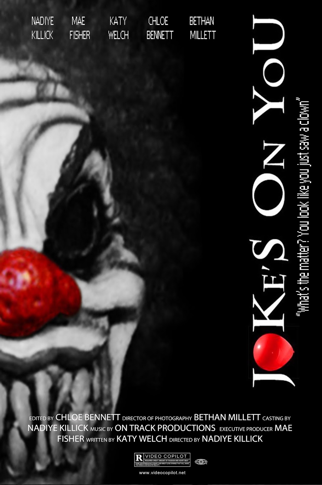
The film poster was a very important factor within effectively portraying the films genre, as this is the main factor of which the public would be viewing in terms of whether to look further into the film in terms of seeing the film. We developed this idea by having many ideas o who to involve within the poster, but in the end we settled on a bold but simplistic look. So therefore we only used our antagonist clown within the poster much alike our magazine cover, but we wanted the film poster to be the most unsettling and disturbing, so with this in mind we decided to use a close up image of the clown, to which we only used half of the clowns face in order to show the sinister intentions of the clown, by showing him lurking and luring out of complete sight and showing a smirk that unsettles the receiving audience. Setting the perfect atmosphere for a horror film by involving a frightening and unnerving sense of imagery that would effectively show the audience what they are getting themselves in for. We had the films title shown vertically, in order to show a distorted effect and stand separately out of the clowns way, so as to not take the main focus off of the clown's face. The idea of having a slogan beneath the title also further shows the genre of our production. This slogan reads, "Whats the matter ? you look as if you've seen a clown", which hangs off the plot of the clown being a main sense of plot and the main course of tension and distortion within our protagonists lives, But also takes from the famous slogan of "looks as if you've seen a ghost", which shows that clowns are going to be the most frightening thing to all viewers after watching this film and ghosts are nothing.
Final Trailer
Our trailer stands as the main aspect of our productions of which will give the viewing audience the notion of whether to watch the film or not, showing through snippets and scenes of the film, which we needed to show the sense of equilibrium within this trailer, we wanted to show the type of life the protagonists had before the clown disrupted their lives, and to see what they are fighting to get back. We felt by involving this it would show the problem more severely. We focused very much on building the tension up with showing the clown being disturbing scenes of the clown stalking the girls and looking into the camera breaking the sense of realism and focusing on luring in the audience into watching the film and finding out what the clown is capable of and what his intentions towards the girls are. Although we didn't want to show the clown as completely harmless, which is why we involved the clown chasing the girls when they are seemingly alone in a large field, and also when they are in their car desperately trying to get away from the clown, and we see the clown magically appear being the girls in the back seat, also due to the disappearance of one of the protagonists this makes the audience question whether the clown harmed her/killed her, or if she got away ? The clown showing up magically behind the girls also sets the style of genre we have as a paranormal style, and hints to the audience that the clown isn't all he seems to be, due to him showing these supernatural characteristics and demonic clown like appearance.
Within our magazine cover we believed that the less exaggerated our piece was, the more impacting it would be on our audience. By focusing on one aspect and trying to unsettle the audience intensely with this, we believe that it would victimise and intimidate the consumer effectively into showing the correct tension we were trying to build, therefore this would show our receiving audience the genre of our film effectively. The imagery that we used within this cover was a full scaled image of our antagonist, the clown, standing in from of the camera holding the gimmicked balloon in his hand, as he stares scarily down the camera, almost as if he is staring straight at the reader, therefore creating the most effective intimidating tone over the reader, and therefore showing again the films genre the most effectively. We decided to have this image displayed in black and white, which shows the tones as very dark and eerie, which have negative connotations to the film in the sense of happiness, which clearly shows that this isn't a family friendly film, and not appropriate for children, clearly setting the correct audience we want purchasing our film and attending in the cinema. Also by using the character of a clown, rather than any of the protagonists, shows the character as dominating, powerful and very significant within the film, with the idea of knowing that the phobia of clowns is a very large phobia globally, and therefore many who want to be scared who indeed have this phobia may be attracted to this type of film as they know that they are likely to be frightened.
Film Poster
The film poster was a very important factor within effectively portraying the films genre, as this is the main factor of which the public would be viewing in terms of whether to look further into the film in terms of seeing the film. We developed this idea by having many ideas o who to involve within the poster, but in the end we settled on a bold but simplistic look. So therefore we only used our antagonist clown within the poster much alike our magazine cover, but we wanted the film poster to be the most unsettling and disturbing, so with this in mind we decided to use a close up image of the clown, to which we only used half of the clowns face in order to show the sinister intentions of the clown, by showing him lurking and luring out of complete sight and showing a smirk that unsettles the receiving audience. Setting the perfect atmosphere for a horror film by involving a frightening and unnerving sense of imagery that would effectively show the audience what they are getting themselves in for. We had the films title shown vertically, in order to show a distorted effect and stand separately out of the clowns way, so as to not take the main focus off of the clown's face. The idea of having a slogan beneath the title also further shows the genre of our production. This slogan reads, "Whats the matter ? you look as if you've seen a clown", which hangs off the plot of the clown being a main sense of plot and the main course of tension and distortion within our protagonists lives, But also takes from the famous slogan of "looks as if you've seen a ghost", which shows that clowns are going to be the most frightening thing to all viewers after watching this film and ghosts are nothing.
Final Trailer
Our trailer stands as the main aspect of our productions of which will give the viewing audience the notion of whether to watch the film or not, showing through snippets and scenes of the film, which we needed to show the sense of equilibrium within this trailer, we wanted to show the type of life the protagonists had before the clown disrupted their lives, and to see what they are fighting to get back. We felt by involving this it would show the problem more severely. We focused very much on building the tension up with showing the clown being disturbing scenes of the clown stalking the girls and looking into the camera breaking the sense of realism and focusing on luring in the audience into watching the film and finding out what the clown is capable of and what his intentions towards the girls are. Although we didn't want to show the clown as completely harmless, which is why we involved the clown chasing the girls when they are seemingly alone in a large field, and also when they are in their car desperately trying to get away from the clown, and we see the clown magically appear being the girls in the back seat, also due to the disappearance of one of the protagonists this makes the audience question whether the clown harmed her/killed her, or if she got away ? The clown showing up magically behind the girls also sets the style of genre we have as a paranormal style, and hints to the audience that the clown isn't all he seems to be, due to him showing these supernatural characteristics and demonic clown like appearance.
Evaluation 7: How have you established a brand identity?
Our brand identity was something that we wanted to show a strong and powerful message. We wanted to make sure that we incorporated the correct style in our productions, otherwise we wouldn't portray our genre correctly. We wanted to make sure that our production was as professional and legitimate looking productions as we could create.
This is shown within different aspect of our work, such as our production title's. Our production company was called "purple lake productions", which we thought connoted the correct atmosphere for our genre of the productions. Showing the idea of a "purple lake", shows the mystery and ghoulish connotations off of this idea.we wanted to make sure our production company showed that it was a company that specialised in dark and horrific style of film. We edited the image that we used in photoshop, were we edited our simplistic image of a lake, into a darkly lit and spooky looking setting, and most importantly changed the colour of the water within the lake into the colour purple. This did not prove to be a difficult task, as photoshop is a simple piece f software that is very flexible and easy for first time users, although in our group we did have previously experienced photoshop users, which helped with making sure our imagery for the production company looks professional, and accurately represented the genre of our film and ultimately our brand's identity.
Within our actual ancillary texts we establish a brand identity. This was through our magazine and film poster. Mainly through our film poster, to which we portray ur brand through our film's title "joke's on you", not only does the title fit to the brand of our genre by saying that a "joke" is going to be at a victims expense, but also our clowns character, as clowns are stereotypically joyful and happy making jokes and playing tricks children and teens. Therefore successfully conforming to both our genre and the professional image that would create our brand's identity. The balloon also achieves a professional look to our brand, as it shows the link to the clown within the trailer who always is seen with a balloon, and also shows the impression of violence and blood due to the electric red colouring we used on the balloon. Within our magazine cover, we showed our brand effectively through the magazines title also, showing through the magazines title, "diverse", the correct type of title that shows our production within, that the type of films that are advertised within their covers shows diverse films, that are unique and show a sense of a stand alone plot. Which shows our brand as a serious and powerful styled brand.
We also had a large factor contribute to our brand, was those we were attracting to our production. Our target audience varied for a while between the ages of 12-15, then ultimately through the imagery we decided to target 15+ viewers, as we found the the frightening and intense scenes, would prove to be too much for our younger viewers. In this case we thought that the main group that we would attract is 15-22 year olds, as this age group tends to be the most wanting to seek thrills and want to be scared, also due to the protagonist cast being within the late teen bracket, this will make the audience put themselves in the protagonists shoes and this will further impact the scare factor within this age group.
Evaluation 6: How do you establish a narrative in your trailer ?
The narrative within a production shows the structure of which is used through the different aspects of the plot. This is usually through the characters, settings,sound and camera shots. Within our trailer we decided to consult other horror trailers in order to install the correct narrative within our production. This is usually following the same style of structure throughout this genre. The idea of having a cast of protagonists happily living their lives, whether they re innocent or not, Then the ideology of Todorov's equilibrium distortion is brought in. A major threatening act is then taken, which distorts the equilibrium and causes issues for our protagonists, and through this issue they try to solve this problem and whether they remain to live or not usually the equilibrium is restored and the evil force is overcome.
Through our trailer structure we present our film in a chronological style. Which furthermore shows Todorov's theory of equilibrium as we show our protagonists walking along in broad daylight, chatting and laughing without a care in the world. But then suddenly this all changes when we see them running in terror, away from a petrifying clown in a park at night. This therefore shows the distortion within the plot breaking the equilibrium, although we do not obviously show the restoration of the equilibrium, we show a sense of calmness over the trailer, which breaks the tension for which we built up through our editing process of showing the darkness of both the setting and the overall atmosphere of the chasing of the clown, this is where we show a candle being blown to, to show a sense of something coming to an end. This also hints to the narrative of how the girls try to and solve the problem. As due to the time of which the film is set, in modern time, Candles aren't used as a source of light, as electrical lighting is used within houses. So when we see this shot of a candle being blown out, it hints at the possibility of a seance in a bid to rid the clown from their lives. Therefore reinforces the paranormal style of horror that we are trying to show.
Barthe's enigma codes theory, is also shown within our production. We use this concept in order for our audience to decode certain mysterious aspects that we have involved within the trailer. For example our clown's purpose in trying to reign terror over the girls and cause fear and tension over their lives. We don't show the clown being violent in any way at all, only showing the clown chasing the girls, which leaves the audience to unravel why the clown may be trying to mentally torture the girls. this leaves the audience to question whether the clown wants to harm the girls. or gain something from them. We also show the enigma of whether the girl fight back or not, and whether they survive from the clowns clutches, as we only show the girls being fearful, but not actually harmed. In one of the scenes were the girls are trying to escape within their car, we see that only two of the girls have made it to the car, leading the audience to question whether the third girl managed to escape alive.
Tuesday, 28 March 2017
Evaluation 4: How have you made your trailer seem like a trailer ?
A main goal our group wanted to achieve when creating our production was to get a professional look. We wanted to incorporate the correct mise en scene, sound, editing and camera shots/angles. Therefore we examined many paranormal and slasher styles in order to take inspiration from successfully portrayed horror trailers.
These trailers that we consulted showed the idea that there should be a wide variety of camera shots and angles, this shows the idea of creationism and diversity. Within our opening shots, we found that a popular shot type to use within the opening scenes are establishing shots, this gives the audience the immediate setting of the film and the type of horror that it will be, paranormal or slasher, through the location, which can usually be stereotyped to a certain style of horror. Although our opening scenes does establish a house, which can show either the impression of paranormal or slasher, so this shows an enigma to our audience, a sense of mystery of what our film will be like.
The types of shots that we included within our trailer, conform to the stereotype of conventional horror, using certain editing skills incorporated with these shots, we used a lot of fading to darkness, to show the audience the sense of night and uneasiness. We also involved the idea of sudden flashes on sight of the antagonist clown, In order to conform with the element of shock and making the audience jump, this was also paired with the sound effect of a sharp chime sound, that resembles a knife slicing the air, giving off the correct impression of violence about too occur. The final fade method we used was the non-additive dissolve. We used this again with shots of the clown to create a paranormal atmosphere, and show the clown as almost shapeshifting and teleporting, showing that this isn't a regular human being.
Another element that was used in our production to make it seem as much like a professional trailer as we could, was our characters mine en scene. The main character that our group wanted to make sure was effective through their costuming, was our antagonist, the clown. The costume that we decided to use for the clown was a black hoodie, black jeans and a white demonic clown mask with electric red afro styled hair and nose. This we felt subverted from the normal route that a clown would be costumed in for the usual clown involving horrors, so although this subverts in this sense, but we feel like this creates a professional look for our trailer, as the mask itself shows the correct type of prosthetics that would be used in a professional horror film, instead of doing a makeup look that would appear extremely amateur.
Sound also played a large role within our trailer. We made sure to conform heavily within this category, we sued multiple chiming sound effects that play within the Tims of which our most frightening scenes and moments occur, in order to even taken these frightening moments further, we added these sound effects to take it to the highest level. Our main soundtrack that covers the majority of our trailer shows to be an eerie and creepy piece of music that is very much piano based, This also shows moneys were it suddenly drops and shows sounds of sharp strings and this corresponds with our clowns scariest moments, in order to show our clown as the most threatening and evil character. Over certain parts of our soundtrack that actually overlaps it with jazz music that is playing from the record player that we used to show a peaceful atmosphere within this specific location, which was the house of our protagonists that was shown at the beginning of the trailer, the shows that the audience should view this location as the protagonists solitude from the clowns grasps. The final part of sound that as involved was carnival music that was incorporated at the end, which conforms to the root of were clowns stem, from carnivals and circuses, we also involve the voice of a child within the music where she states "follow me", luring our audience into the horror of our film.
Saturday, 25 March 2017
Evaluation 3: How alike film posters and magazines are your ancillary texts?
The ancillary texts that our group created of a magazine cover and a film poster, which display our horror trailer, our group brainstormed on ideas on what would most effectively establish our films genre. Therefore we took to the internet to try and gain inspiration from various film posters and magazine covers. For our magazine cover we mainly viewed empire covers, which is branded one of the highest redeemed film magazines in the industry therefore we thought that. taking inspiration from a highly regarded magazine, it would give our cover a more professional image.
 The magazine cover that we chose to take inspiration from was the jokers in 2015, where we saw Jared Leto with his interpretation as the new villain, we believed that seeing the villain dominating the cover standing up and appearing confrontational, accurately intimidates the audience and sets the powerful and dominating characteristics of the villain. That is why with our film's magazine cover, we also set our villain standing up, in a creepy location alone, showing the clown looking directly down the camera, as if he is staring right into the audiences eyes, again intimidating the receiving audience, accurately portraying the films genre as horror. We didn't use a particular editing tool of software when creating our cover, therefore it was created based on the photograph we had taken of our clown, which would be the base of the entire surface of the magazine's cover.
 We simply added text and imagery over the top of the main background. With this the group decided that we wanted to promote the film effectively, by placing our film's title body at the centre of the cover underneath the majority of the clown. The magazine's clout scheme was black and white, but displayed only one tone of colour, this being the red of the blood on our film's title, again showing the tension of violence and blood, This also attracts the consumers to be attracted to this colour on the magazine, as due to the simple tones of black and white on the rest of the magazine, it is instinct for the reader to have their eyes drawn to the only part of colour on the screen, and with this being our film title, the most important part of the magazine for the audience to take from, so that they can go to the cinema and watch the film and buy spread the word to their friends and family about the production. We also thought to give a more professional look magazine promotions are an often tactic on how to get consumers to buy the magazine, with us this was done through the bold blue logo on the front which states that inside a free movie poster of the film is available, which again we believed gave a professional look to our production.
 Our group especially liked the film poster for the 2001 horror flick "Hannibal", which displayed an extremely disturbing image set on a dimly lit background, with a sinister face displaying inhumane like qualities, showing deep, blood red eyes, while showing a sinister smirk, making the audience immediately feel uncomfortable and sense the horror genre effectively. Therefore due to our antagonist being the sole element of horror to our trailer, we needed to involve our clown heavily within our poster, with this in mind we decided to also show a dark background, with half of our antagonists face edging out of the left. half of the poster, but in black and white only displaying one colour within our poster, red. This created the atmosphere of violence and blood, creating the correct tone for our audience to take to base on what our films genre and style will be like.
 We thought that a poster that was less dramatic and filled, would be more of a statement, Therefore with this technique of showing limited text and visuals, this shows the seriousness of the film and that it a disturbing and paranormal style of horror. The text that we did involve within our poster was simple, we involved the main characters within the film along the top of the poster above the clown, the font we chose was an old fashioned digitalised font, showing hints towards the time that it is made and how technology could be involved within the films plot and also the font itself shows an eerily creepy effect. Then another piece of text we had on the poster was our vertically placed film title in bold large white writing, also again showing the red balloon, to show the tones of unsettling violent themes. We placed the same digitalised font underneath this with a cute from the film which states "whats the matter? you look as if you've seen a clown", Which takes its origins from the infamous saying " you look like you've been a ghost", which we wanted to spin into our own as if our antagonist had said it himself and shows an opinion that after watching this film, you will believe no matter what that coins are scarier than ghosts.
 The magazine cover that we chose to take inspiration from was the jokers in 2015, where we saw Jared Leto with his interpretation as the new villain, we believed that seeing the villain dominating the cover standing up and appearing confrontational, accurately intimidates the audience and sets the powerful and dominating characteristics of the villain. That is why with our film's magazine cover, we also set our villain standing up, in a creepy location alone, showing the clown looking directly down the camera, as if he is staring right into the audiences eyes, again intimidating the receiving audience, accurately portraying the films genre as horror. We didn't use a particular editing tool of software when creating our cover, therefore it was created based on the photograph we had taken of our clown, which would be the base of the entire surface of the magazine's cover.

Tuesday, 21 March 2017
Evaluation 2: How does your use of sound compare with trailers of similar genres?
Within our media productions, our trailer's genre of horror set out a difficult task of the correct use of soundtrack and sound effects throughout the production. Although our group initially thought that finding creepy, non-copyrighted music would be easy, we found that none of what we were finding suited our type of horror trailer that we were presenting visually, slasher.
Though we eventually did find the correct eerie and creepy soundtrack to last throughout the majority of the trailer, towards the end of the trailer we closed off with a carnival theme tune, as to conform to our antagonists character, a clown. Within the film industry, many methods are taken into consideration throughout an entire film, such as the "folley process", which covers over sound that isn't as emphasised within the physical scene, We didn't use this method within our production as we didn't use dialogue throughout the trailer, in order to conform to Barthe's enigma codes theory, where our group wanted to use suspense and mystery throughout the production,, leaving little known about the films plot, as to show an aspect of unpredictability.
Sound effects wise within our film, we initially started with a "boom" sound effect, this was an aspect our group wanted to involve within the beginning of our trailer, as we wanted to attract our audiences attention straight away, so this loud and abrupt sound effect would cause a jump effect and therefore thrill them into continuing to watch. We visually paired this effect with an establishing shot of our protagonists house, immediately showing the audience that this will be an unnerving setting within the production, due to the sound effect placed over the top of this shot. We then suggest to our audience that the film isn't being set in modern day, du to the continuous shots a spinning record player, which is projecting jazz music over the top of our creepy main soundtrack, therefore creating a building of tension across the scene and also showing that due to the use of a record player this may be set in an earlier time, the genre of jazz itself would also be seen as an elitist type of music, therefore also casting a profile onto the owners of the house, to be from a more middle and upper class background, this is much alike the horror film Ouija 2, which we took inspiration from in our film when it came to the record player.
Within our visual appearance of the clown we often presented on sight of the clown a diegetic harsh chiming sound, this was to create a dark and creepy appearance and character over the his personality. Showing the audience the clowns cruel intentions over our protagonists. We felt as though involving this would show the antagonist effectively. We took influence from Stephan King's IT, when it came to not involving dialogue, as we wanted to show our horror visually, and through our sound, without revealing too much about our plot. We ended our trailer with carnival music, hearing a young girls voice over the song saying "follow me", paying on the stereotype within horror films, that children are creepy such as the poltergeist and insidious. We wanted to create the possibility that this was a trap for our protagonists and ultimately our audience to follow the child's voice and go and see the film.
Thursday, 16 March 2017
Evaluation 1:How have you subverted or conformed to stereotypes typical of your genre?
Within our media production, our trailer, we revolve around
three teenage girls, suffering under the torment and stalking of a psychotic
masked, killer clown. Through this idea we decided to conform to the
stereotypes that are usually portrayed in horror films with characters like
this, so that we can keep an authentic and professional look.
For our protagonists/victims, we decided to show them as
vulnerable, as when they are seen at the beginning of the trailer seeming unfazed and
unaware of their surroundings, and the fact that they are being followed by a
creepy clown that poses a threat to their well-being. Tessa Perkins would say
that this is a simple stereotype, as these characters may not be a minority and
oppressed, but the fact that teenagers are less experienced in life, and are
usually less safe than adults would like them to be and therefore are an easier
target, and therefore are branded with the “dumb” stereotype. This is carried
on throughout our trailer and in one particular long shot, where we see our
teenage victims constantly running, as they are being chased by the clown, and
never seen fighting or trying to think of a way to overcome the clown. We also
pair this with their facial expressions as constantly scared and panicked, with
them never looking determined, or motivated to defeat their stalker. Through
our protagonists mise en scene we wanted to show the standard day to day
clothing that teenager’s in contemporary society would be seen wearing. Though
we did want to show the innocence of their characters, with still showing the
dark tones that are involved in horror films. We feel like the belief that
women being less inclined to fight and manipulate, is shown heavily within our
trailer, as it is intensely shown that the teenagers are terrified of the
clown, and do not even attempt to outsmart and overcome his hold over the
girls, therefore showing the stereotype of women being fragile. Certain
audience members may dislike this approach as it doesn’t empower women, but we
believe as teenage girls ourselves, it is more realistic for our protagonists
to run away, and try to escape, rather than try and defeat a killer, who
resembles paranormal ability’s. Like Stuart Hall’s theory of basing a film’s
plot, over minor details about the film, we can judge on what will happen
overall, based on stereotypes, so after watching our trailer, it is the
ideology of our audience whether they will question due to our protagonists
being innocent teenage girls, will they succumb to their death due to their
disadvantage of being weak and frightened young girls, or will they overpower
the clown, maturing and solving out the way to supress their psychotic stalker.
Our antagonist, the killer clown, shows almost complete
conformity to the genre of horror, With specifically the overall mise en scene
that is produced from his look, The mask that the clown is wearing, showing the
stereotypical pale white face, smudged red makeup, and bright red afro styled
hair. We felt that this would be the most effective look, of showing the antagonist as a mysterious character, as instead of seeing a physical face with clown makeup, a mask shows a sense of mystery to the plot, getting the audience to question who the antagonist is, we feel like this conformed effectively to the horror genre. We did however subvert from stereotype when we decided not to use any violent themes throughout the entire trailer, we felt that we wanted to concentrate on the frightening imagery of the clown, rather than showing graphic violence, as we wanted to be secretive on the plot to show a building of tension and suspense, rather than revealing the entire plot within such a short space of time.
Sunday, 12 February 2017
Saturday, 11 February 2017
Filming schedule day 2
Day 2 Filming
5:00
Our group meets at ashtead park as we know it will be completely dark. When we arrived we made our way up to the playground in the park and filmed various shots of our antagonist clown on the swings, showing the creepy aspects to the clown being in children's playgrounds with malicious intentions.
We then filmed next to the playground on the field, where we filmed various running shots of the three girls and the clown chasing behind them. We filmed this for a long time as we wanted to get the right type of shot.
5:30
We moved over to filming at mae's car, where we showed two of the girls scrambling to get in the car and drive away,we only done this with two of the girls go hint at the death of one of the girls, to show clearly why the clowns intentions were, to harm the girls. There we showed the clown already in the backseat of the car shocking the girls. We done this to show the paranormal aspect of the clown that was behind them magically appearing in the car.
Filming schedule Day 1
For our first day of filming our group wanted to concentrate on our clown, by getting as many shots of the clown in wondering places on its own. Although we do want to film the three girls in brighter lighting together through the same locations as the clown to show them as a target to the clown, and to let our receiving audience that the girls are under threat by being stalked.
Wednesday 2nd November
2:15-Head over to water fields road
Our group headed over to the first location of filming which was the train tracks, the bridge above it was where we filmed our antagonist crossing the bridge from different angles as trains passed underneath, creating an abrupt sound effect that would successfully build tension.
We then cross the bridge into the estate,where we film the three teenage protagonists as they make their way home from what we wanted to appear as college,we done this through their handbags and their journey together through various locations.
At the very end of water fields, we again filmed our antagonist clown. This time we kept the clown in the same position but instead repositioned the camera so that we can hastily edit the various shots to build tension effectively
3:45-Arrived at Ashtead park
This is where we filmed certain shots of the teenagers passing through the pond and also managed to get a successful shot of birds abruptly flying around the pond. This was the last footage we filmed on day 1.
Friday, 10 February 2017
Our title research
 The first title I have inserted above shows the first design our group created, one theme that we wanted to carry out throughout the entire designs was to involve our own gimmick,being the balloon, except we didn't know which would be the best position so in the following designs you will see different placements throughout. What we liked about this font was the thin design, connoting a sickingpy and frail theme, also through the capitalised letters we thought this gave some boldness to the title. We also really liked the colour red being involved within the title, due to the fact that our antagonist holds one main bright red colour within their mise en scene, with red hair,nose and lips.
  This particular design sits as my favourite as I believe this font being the boldest of the four, stands as the most effective and shows the correct tones for what our trailer is, a clown that should be kind and caring of children, and although the font and colour would give off the effect of happiness, the title itself creates the effect of everything not being what it seems. I also prefer the balloon being placed within "jokes" as I believe this is the most appropriate word for the balloon to be centred.
  The next title shows the same features to the first title, except I believe the balloon is placed in a more appropriate position as I believing placing the balloon in the word "jokes" it makes more sense rather than with either of the other two o's, therefore I believe that although the balloon is placed better that in the first title, I don't like the thinness of the font as I don't believe it's as effective as the bolder fonted title.
This is one of my favourite titles as I really like the graduated effect of colour within the title. I believe the fact of having the word "jokes" in red connotes the correct tone for the word itself, and with having the black colouring into "you" targets the audience specifically and connotes evil and darkness making the audience feel scared for themselves. I think it also sets itself out as different though this idea of graduating the text, whilst also matching the mise en scene of our antagonist,who only shows the colours of red,white and black.
Personally I prefer the second title as it is very bold and drastic and I believe it suits our films genre perfectly. Although our group isn't decided on anything yet but we definitely know for a fact with prefer the titles that have the balloon placed within the word "jokes".
Trailer's Film Poster

For our film poster our group decided that we wanted to although use the same imagery, we wanted two posters. One that is shown above with what we thought displayed the correct appearance and imagery of the clown. Showing him with just half of his face shows the audience that he is hiding away but still preying on people to attack showing him as the sinister and evil character that he is. We wanted to use a slogan or a quote for the poster and so below it stating " what's the matter? You look like you've seen a clown" we wanted to take a spin off of the saying, you look like you've seen a ghost. Putting this in quotations aswell shows that it is used in the film, showing that the clown gain is there with intentions to scare and hurt.
We wanted to use quite a simplistic look to show the seriousness of our film. We wanted to portray minimal colour to show minimal excitement but more terror, we took inspiration off of the film poster for " Annabelle"
Which like our poster used more simplistic imagery to frighten their audience. The poster below shows the
Other version that our group came up with. In my opinion I prefer the second poster due to the fact that I really wanted to be simplistic and using a black and white colour scheme and only using the colour red in the clowns nose and on the balloon, connotes the correct theme of blood and violence, without going over the top.
Trailer's Magazine Cover
 For our magazin cover we wanted to show a very professional look,whilst also trying to conform effectively to our genre. So our idea of using a black and white cover we believed was a very good idea as covers such as the godfather and James Bond, used this effective to show its importance and the difference from this film to every other horror film.
 But to bring something eye catching to our cover we used a bright red coloured ballon within he films title, this effectively connotes tones of violence,blood and murder.
The white text we used was to also stick to this simplistic and classy looking theme we wanted to follow, showing a serious look to show this would be a seriously scary film.
We also advertise the fact that the film is similar, if not a remake of the 1990 horror hot,IT, showing the receiving audience that if they enjoyed that cult classic,which would mean a lot more consumers in the cinema and when buying copies,would be attracted to go and see this film.
Location research
Seeing that our production is a trailer our group realised that we would need to use a variety of shots, therefore we believe it is essential that we use multiple locations within our trailer. But we needed to think carefully about what would connote the correct the right tones for our genre of horror.

 The idea of train tracks again came from the Thought of danger and where an area would be deserted and scary enough for our antagonist to roam around. We not only thought about visuals here,but also sound effect wise, the abrupt noise that the train will make as it harshly enters, will create the type of jump factor that we want to put on to the audience, so that successful tension will be built as we see our antagonist roaming around deserted and dangerous areas.
Park-In the evening.

Our group decided that it would be an effective location to set part of our trailer within the park around our area as we believe the large field and dimly lit area would create the accuracy of a horror setting, as it presents it self as an extremely unnerving and frightening area. It also makes sense plot wise for our antagonist to be in an area such as this. Due to the fact that children spend their time in parks and our clown is a psychotic clown looking for children to terrorise, it seemed an appropriate location to show some shots.
Protagonists home.
Our group decided to push boundaries and scare our audience we need to create the image in their heads on whaf if they were in the protagonist position. So a home invasion is a very uncomfortable situation as home is supposed to be somewhere where individuals feel safe whereas that feeling is questioned when we show that the protagonists aren't safe within their own homes. We also decided that one of our houses was the best idea as one of the members of our group,Katy, has large sliding glass windows that we would like to use to make our protagonists appear unsafe.
Train tracks
The idea of train tracks again came from the Thought of danger and where an area would be deserted and scary enough for our antagonist to roam around. We not only thought about visuals here,but also sound effect wise, the abrupt noise that the train will make as it harshly enters, will create the type of jump factor that we want to put on to the audience, so that successful tension will be built as we see our antagonist roaming around deserted and dangerous areas. Mood board and props

Picture 1
In the first image on my mood board I have decided to use an image of the clown mask that we will be using within the film, the mask appears as very demonic and supernatural, and our group believed that this was extremely effective in making the receiving audience feel uncomfortable and frightened. We believed specifically the bright red hair, and yellow fanged teeth set the correct tone and image that we wanted for the clown, paranormal and psychotic.
Picture 2
The Green balloon image shows one of the props that we are going to use, This particular prop stands as one of, if not the most important prop that we will be using, the balloon stands as the main gimmick in our trailer, if you see the balloon the clown will not be far away, including in our film's title we are debating on whether to include a balloon somewhere within the title, to carry on with this gimmick.
Picture 3
The image of the park I inserted at night accurately represents one of the location's that our group have decided will be an effective area to set certain shots of our film, As a location where children tend to hang around, we believe that seeing as a clown is usually known to be a children's entertainer, our clown would most likely be seen in a location such as this. But to give the location a better tone and representation of our genre, we believed that filming at night would be more effective for our genre as horror.
Picture 4
The fourth image I used within the mood board, was a shot of a record player, Throughout our trailer we showed random close up shots of a spinning record player, which we thought successfully built tension within the trailer, going from the majority of our shots being fast paced, then suddenly cutting to a slow paced shot of a record player spinning, we thought productively put our audience's emotions in a rapid pace.
Picture 5
I then inserted an image of three happy, innocent looking teenage girls. This is due to the fact that our group wan ted the girls to come across as the average day to day teenager, who was mercilessly being stalked and attacked by a psychotic killer clown. But we believed that in order to conform correctly to the film's genre, we needed to use some darker tones within their mise e scene, even if its through simple black jeans, as we believe having all lighter colours in their clothing, would connote the wrong type of image.
Picture 6
The last image that I involved within my mood board was the image of the train tracks. This is due to the fact the our group spent a lot of time filming across a bridge that had trains passing underneath it, our group believed it appeared as a dangerous area and would appeal to our antagonist the clown and would be an accurate place to film our clown. The loud noises as the trains pass also built tension well, as the loud abrupt sounds as the train harshly enters would be the right type of sound effect to create a jump/shock scare upon our receiving audience.
Thursday, 9 February 2017
SoundTrack Reseach

But through our antagonist we immediately thought the correct type of music to be used throughout the trailer would be some sort of circus/carnival music. Although because we aren't set location wise at a carnival, we decided to only use a clip towards the end of the trailer to build the final increased tension. Some of our options I've listed below
carnival music Throughout our trailer we decided we needed something eerie and creepy that could fit into more than just a carnival clowns appearance but to also the location around him, outside of a circus or carnival setting, but still to have the soundtrack fit into the scene and to make sense. So we decided to use a slow paced but high pitched soundtrack to build tension,but to show elements of shock and fear that we'd like to involve within the emotions that we want our receiving audience feel. So to do this we will add in loud and harsh sound effects throughout when we see frightening shots of our antagonist clown. I've listed some backing soundtracks below.
Costume Research 2
Our protagonists, although less important than our antagonist, we still wanted to portray the ages of which they were playing correctly whilst still fitting in with the trailers genre. 
We have three main protagonists within our trailer, Mae,Jennifer and Molly. Three average teenaged girls who are targeted by a merciless,psychotic clown.
Due to the three girls being just regular teenagers in contemporary society, we needed their style to fit into what the everyday teenager looks. So in this case we decided to use everyday clothing such as jeans and casual tops, but still to fit into the genre, used darker colours within the clothing decisions.
Also due to the fact that our target audience will be teenagers of a similar age, it is vital that we correctly portray teenagers of today, so that we create the correct image for the receiving audience.
Titles Analysis
For our trailer,with our genre being horror, our group wanted to conform accurately to our production and use the correct font, colouring and positioning for our film. With this in mind we decided to look at other films of our genre and that were similar in style to see what would be suitable for our own trailer.
 This particular title seemed very effective to me as it shows the correct styles within its imagery to conform to its genre. The bright,blood red effectively shows the impression of violence and gore which also boldly sets out the title from its bleak,dark background, which fades into the top of the text, creating a shaded and secluded tone. Within the bold capitalised font we can see black marks which appear to look almost like twigs on a tree, possibly suggesting it's location setting as a dark Forrest. But also could be seen as scratches so again this could possibly be outlining the violent themes within the film
 This title appealed to me as it showed again effectively the style of horror that they were presenting, with the knife like text we can see that this is probably a slasher style horror,matched with the random streams of blood flickering with light on the blade, shows the receiving audience that the film they are doing to watch will be very gruesome. Again with the text matched with a black background it effectively stands off the poster and sets a dark tone over the film.
 This title also stands as an original title with an actual imagery being used within the text. And instead of using a darkly coloured text, a bright bold capitalised white text is used to stand off the bang, creating a somewhat distorted tone, the image within the text itself appears to be a normal looking human, but looking more closely we can see strange hands appearing out of its coat with abnormally long fingers sticking out. This effectively shows the receiving audience the films main character and must match the films title and be "the thing" in question.
This particular title seemed very effective to me as it shows the correct styles within its imagery to conform to its genre. The bright,blood red effectively shows the impression of violence and gore which also boldly sets out the title from its bleak,dark background, which fades into the top of the text, creating a shaded and secluded tone. Within the bold capitalised font we can see black marks which appear to look almost like twigs on a tree, possibly suggesting it's location setting as a dark Forrest. But also could be seen as scratches so again this could possibly be outlining the violent themes within the film This title appealed to me as it showed again effectively the style of horror that they were presenting, with the knife like text we can see that this is probably a slasher style horror,matched with the random streams of blood flickering with light on the blade, shows the receiving audience that the film they are doing to watch will be very gruesome. Again with the text matched with a black background it effectively stands off the poster and sets a dark tone over the film. This title also stands as an original title with an actual imagery being used within the text. And instead of using a darkly coloured text, a bright bold capitalised white text is used to stand off the bang, creating a somewhat distorted tone, the image within the text itself appears to be a normal looking human, but looking more closely we can see strange hands appearing out of its coat with abnormally long fingers sticking out. This effectively shows the receiving audience the films main character and must match the films title and be "the thing" in question. For our trailers title our group feels it is most appropriate to use an incorporation of all titles used as example here. We want to use a darkly lit background ,most likely black. Paired with a brightly courted text. And a gimmick from our trailers plot involved with it. To make it stand as an original design.
Subscribe to:
Posts (Atom)