Saturday, 26 November 2016
Character roles within our Trailer
The Clown (Antagonist)- Played by Katy
The clown character within our trailer stands as the sole scare factor within our trailer, so in this case we needed to make sure we used the right actor that would effectively portray the terrifying, psychotic clown that we needed. So due to the fact that Katy was tall and slender, it seemed like visually the right type to play the antagonist as both due to her height she appears very intimidating, but also her frame makes her appear as able to chase and over power three young teenage girls.
The clown as a character we wanted to come across as very mysterious, and leave a lot to the imagination and to the receiving audience's wonder, as we believe that revealing too much about the clowns, reasons and intentions on the three girls wouldn't be how a professional film trailers plot would be structured.
Jennifer (Protagonist)- Played by Myself
As one of the three young teenagers, I felt that both due to our project being different to our as production, we decided we wanted to change the type of roles we were used to, and due to last year, and me playing the antagonist, I wanted to challenge myself into a protagonist role and due to the fact that we are true friends in real life, we believed that i would have good on screen chemistry with the other two protagonists.
The character them self, shows to have similar interests to her friends, but we also want to draw differences between the group, we believe that their way of thinking when it comes to overcoming the clown, Jennifer will be stronger and have different opinions to her friends, which will possibly cause problems when trying to overcome the psychotic clown.
Mae(Protagonist)-Played by Mae
Our second protagonist, Mae, would be more of a shy character in contrast to Jennifer's character, although will voice her opinion within the group, and often finds herself in the middle of the two other protagonists, Jennifer and Molly.
Mae believed that due to her success as a protagonist last year, she would be more comfortable returning to a protagonist role within our production this year. Our group agreed as we believed that she would be very well suited to the role due to her appearance as innocent and calm looking
Molly(protagonist)- Played by Nadiye
Our final protagonist Molly, is shown as a very domineering character within the friendship group, constantly bickering with the fellow protagonist,Jennifer, She voices her opinion very often within the group, which we wanted to involve as to have a character that would be frantically panicking within the scary situation of being followed by a malicious clown.
Lat year Nadiye played the main protagonist in our production very successfully, and again our group as a whole felt that Nadiye's skills very much suit the role of a protagonist and therefore we felt she would work best within her role as Molly.
Costume Research 1
For our trailer. We need to think about our muse en scene and what would be the most appropriate clothing and styling for both our protagonists and antagonist.

As the antagonist and also in humane character of our trailer our clown character stands as the most important costume styling we have to consider. Our actress Katy will be playing th role of the clown and in doing so instead of creating a clown makeup look we have decided a more effective and frightening approach would be to use a mask and therefore have purchased the following mask...
The pale white face, in contrast to the bright red hair,nose and lips shows that the character being as important as it is will definitely stand out perfectly whilst wearing this.
We were considering to use an entire clown outfit even considering to purchase a full checkered black and white bodysuit to give off the impression of a once professional clown. But we believed for an outfit like this it would of had to of been a slightly different story line. But with what was occurring in the media we believed it would be a good idea to work with what was scaring people in everyday life, and with the clown scared happening across America and some areas of England. We though the best idea was to use a psychotic looking individual who wore normal everyday clothes but still fit to the character, so we used plain black jeans, a black hoodie and black trainers. We believe this would be worn as the clown would want to remain as inconspicuous as possible.
Friday, 25 November 2016


Questionnaire
1)Who do you prefer seeing as an antagonist ?
A)Male
B)Female
2)How often do you watch a film weekly ?
A)None at all
B)1-2 films
C)3-4 films
D)5+ films
3)What location do you find the most daunting?
A)House
B)Alleyway
C)Woods
D)Park
4) What was th last horror film you watched ? Did you enjoy it? If not,why?
5) Do you think that it is important to see the antagonist of a film within it's trailer?
A)Yes
B)No
6)What is your favourite horror film out of the following?..
A)IT
B)Paranormal Activity franchise
C)The exorcist
D)Drag me to Hell franchise
E) Cabin in the woods
7)What genre do you prefer out of the following ?
A)Horror
B)Action
C)Thriller
D)Romance
E)Comedy
8)What film title appeals to you the most?
A)"Jokes on you"
B)"Revenge"
C)"Karma"
D)"Joke"
9)What do you find the most scary out of the following ?
A)Ghosts
B) Super natural
C)Clowns
D)Serial killers
10) Whodo you think will portray a protagonist the most effectively ?
A)Yoing girl
B)Teenage girl
C)Young boy
D)Teenage boy
E)Old lady
F)Old man
Age Certificating Research
With our trailer being of the horror genre, our group wanted the opportunity to have the freedom to use more intense scenes and imagery within our content, for example the use of fake blood and violence and with frightening images, with our leading antagonist being a clown, many younger audiences would find the character alone very disturbing, but to really create a professional horror film image, we want to have the intense and frightening scenes that would make this happen.
 With this in mind the thought of having the age rating of a 12/12a seems like a less likely option due to the bbfc stating on their website that "No promotion of potentially dangerous behaviour which children are likely to copy. No glamorisation of realistic or easily accessible weapons such as knives. No endorsement of anti-social behaviour." which would make our horror an incredibly difficult task to fit into, as our horror being of slasher style and gorish instead of paranormal. The BBFC also state specifically that gore, violence and blood shouldn't be emphasised, and with our overall aim to emphasise and scare our audience make it extremely difficult to fit into this category.
 Therefore our group are feeling extremely compelled to opt into having an age 15 certificate of our film's trailer, this is due to the BBFC stating under the threat section of the 15 certificate rating that "There may be strong threat and horror", which would make the scenes that our group want to film a lot easier to access and film without worry of being to much with gore under a 12 or 12a rating. Although it is specified that "Violence may be strong but should not dwell on the infliction of pain or injury. The strongest gory images are unlikely to be acceptable", which our group may or may not decide to follow in theme, as we want to have the opportunity to use both paranormal and slasher style if we choose to,depending on the footage we get.
 An age 18 certificate rating, This rating gives our group a a large amount of freedom to involve a lot of our footage that may not be acceptable for an age 15 or 12 rating, although we are given a lot of freedom to include almost anything, whether it be frightening or gory, Although we would have a major limit on who our viewing audience would be, as the major target audience for is young working class teens and adults, seeking thrilling fun, whereas older adults aren't as interested in being frightened.
In conclusion, our group is going to go for a an age 15 certificate rating in order to achieve a more realistic and professional looking horror trailer.
 With this in mind the thought of having the age rating of a 12/12a seems like a less likely option due to the bbfc stating on their website that "No promotion of potentially dangerous behaviour which children are likely to copy. No glamorisation of realistic or easily accessible weapons such as knives. No endorsement of anti-social behaviour." which would make our horror an incredibly difficult task to fit into, as our horror being of slasher style and gorish instead of paranormal. The BBFC also state specifically that gore, violence and blood shouldn't be emphasised, and with our overall aim to emphasise and scare our audience make it extremely difficult to fit into this category.
In conclusion, our group is going to go for a an age 15 certificate rating in order to achieve a more realistic and professional looking horror trailer.
Inspiration for our Trailer
Our film trailer is very much focused on a slasher type of horror film, with our main antagonist being a psychotic killer clown, who follows three teenaged girls with cruel intentions. We took inspiration from certain style movies that really helped with the imagery and sense of plot.
Ouija: Origin of evil

The trailer for this film, effectively built tension and gradually became scarier, for certain scenes we would jump to a record player that we felt would fit 8nto our film's trailer, so therefore we also involved multiple shots of a record player in order to establish tension in our trailer. We believed that having this type of horror influence would bring a larger sense of paranormal to our trailer as we wanted to portray our antagonist clown as not in humane and put him at a higher capability of strength and power than our protagonists.
IT

We took inspiration from the clowns appearance with a white face and bright red afro like hair, which effectively stands off of the screen, we found that the clowns muse en scene through makeup was something our group definitely wanted to use similarity to as we believe it was a truly bold and frightening image that would effectively scare our audience. We also believed that through the fear of clowns being a largely popular phobia globally this type of fear factor would appeal to all ages.
Brainstorm for our Trailer
Our group thought that following our as thriller film, we wanted to change genres to put ourselves at a bit more of a challenge. With this in mind we believed that a horror film would be challenging in trying to find what scares the majority of the receiving audience. Again we tried to think of contemporary Day and what was relevant at the time, and we came to the conclusion of clowns. With there being a big media frenzy across America and some areas of Britain, we believed this would be an effective and frightening subject to cover.


We then had to think about how we were going to involve a clown into a horror plot, which is where we came to a conclusion of having 4 protagonists against one clever, manipulative and powerful antagonist, possibly paranormal ? With this in mind a possible title we liked was "Jokes on you" linking back to our antagonist.
We thought that due to the fact that we were having a large clichè such as a clown involved. We decided we would like to subvert by having an all female protagonist cast, as usually in horror films there is a dominant male protagonist.
Location also was proving to be a hard decision. But ultimately we thought do to our production being a trailer there should be multiple locations. Therefore we chose to film across roads, parks and homes. To show a variety of shots of both our protagonists and antagonist, to show an accurate summary of the film without revealing too much of a plot, like a professional trailer would do.
Costuming and mise en scene is very important when it comes to our clown antagonist. We considered using making to create a scary and more realistic look. But ultimately decided a frightening demonic clown mask would be a better choice, paired with black clothing to fit to the tones of evil and darkness.
For our protagonists we decided that although we want to portray innocence within their characters we still want to show some dark colours within their clothing in order to portray the correct tones for the genre, also sticking to casual clothing to fit in with what the average contemporary teenager would wear.
Institution Research
The following film institution are of which that I find inspiration from and from which we will use to make our own logo for the film trailer, These are the ones that i find the most successful, well know and well designed.


Paramount:

Paramount pictures is all of a film studio, television production company and motion picture distributer. Beginning in 1912 Paramount pictures began, paramount pictures is one of the longest surviving film companies in american history.Following with success such as being the first major Hollywood studio to distribute all of its films in digital-form only, which shows a beginning of the future starting with this production company. This particular company is famous for the successful films such as Titanic,Forrest Gump and the Iron Man franchise, which grossed over a billion dollars.
DreamWorks:

DreamWorks studio is an american film production company which produces and develops films, television programming, and video games. Producing or distributing over ten films in the box office grossing over 100 million dollars each. Currently DreamWorks is in business with Walt Disney production. Staring in 1994 DreamWorks was created and continues to work successfully to this day, DreamWorks is well known for endorsing films such as Fright night, The Help and the soon to be hit The BFG.
Columbia :
 An American film production and distribution studio of the Sony Pictures Motion Picture Group, Columbia pictures was created in 1918 founded by brothers Jack and Harry Cohn, going public in 1926. Being caught in by Coca Cola in 1982, the company was in a joint business with the new production company Tristar, to which were both then brought by Sony in 1989. The success' of this specific company would come from films such as the James Bond franchise, Spider man franchise and the Men in Black franchise.
Lionsgate:
 Is a Canadian- American production company, It is the largest and most successful mini-major film studio in North America. The company was created in 1997 by Frank Giustra, With the first mega success of the company showing with 2000's American Psycho.The company mainly focuses on foreign and independent films, although has branched out into more popular films that are well liked by the public like, The hunger Games franchise, The Divergent franchise and The Twilight saga.
Columbia :

Lionsgate:

Thursday, 24 November 2016
Magazine Film Cover Analysis: Scott Pilgrim vs. The World

The magazine cover effectively shows the receiving audience the movie's genre through their use of imagery. With the comic strip like effects, with the bold red background, with the films main character" Scott", standing in the centre of the cover holding a flaming sword.
The colours used are eye catching and draw younger audiences in due to this, also with the advertised character appearing young, shows the target audience being of a younger generation. with his mise en scene, showing him to have dark shaggy hair, a loose faded t-shirt and jeans, typically what the average teen wears.
The credits within the cover show the films title displayed dark and diagonally across the cover, with the font in a bold but action themed. And the tag line above it "The force is strong with this one" showing a link to the successful star wars franchise with the use of the term "force", attracting fans that enjoy sci-fi films to attend the showings of this film in cinemas.
Magazine Film Cover Analysis: Spectre

The lack of imagery within the cover shows the importance of the film, due to the fact that audience's should recognise the actor, Daniel Craig, for his role within the most recent take on the character, within the years 2006-present with casino royale, quantum of solace,sky fall and spectre. The black and white filter casted over the filter show the timeless effect of the franchise, and therefore becomes attractive to new audiences as a highly acclaimed film.
The gun shown on the cover also shows some premise to the genre of film due to the violent connotations of guns, shows a dangerous and action themed film, which effectively shows the films genre.
The credits on the cover are shown as again very discreet in gold and white , showing the idea of not needing to use bright and eye catching colours to get receiving audience's attention, as there isn't the need to due to the reputation this franchise has achieved over the decades. With only one tag line visible stating "bond is back", showing the receiving audience that are fans to buy the magazine to find out all the important details. This also is a sign that the film is targeted an at older audience due to the fact the colour scheme is very plain and not bright or eye catching at all.
Tuesday, 8 November 2016
Magazine Film Cover Analysis: Django Unchained

This is shown within this magazine cover, as an appreciated film as it stands as the entire cover for the magazines "oscar special", making the receiving audience become interested within the film due to it being critically acclaimed.
The spaghetti western that hit cinemas in 2012, depicted a new type of slavery film, with our hero, Django, who in an effort to try and save his wife from a malicious plantation owner, teams up with a german bounty hunter on a bloody mission. The violent nature of the film is also shown effectively through the cover, with the tag line "the good the bad and the bloody, something Tarantino is famous for is his cartoon like blood effects, and this tag line proves that this film will be of no exception.
Also the bold white film title towards the bottom of the page shows a smeared blood stain across it.
The actual imagery of the cover shows three male characters from the film, whose mise en scene presents the old fashioned western accurately, with a black character holding a large pistol as he holds a strong pose appearing very serious, as well as the other two white males behind him, but due to the black male being front and centre, this shows the audience that this is the main character in the film.
There is also another tag line written below the films title, saying " how Tarantino reinvented the west", again showing the receiving audience that this isn't going to be like every other western film out there, and that Tarantino's oscar nominated efforts into this genre is worth seeing.
Thursday, 20 October 2016
Magazine Film Cover Analysis: The Godfather

The older audience is most likely due to be the target audience for this cover as the advertising film "The godfather" was filmed in 1972, Meaning the younger generation are less likely to be familiar with it, therefore it's purpose may be to introduce the picture to younger audiences due to the tagline seen at the bottom of the cover in small simple italic writing, "The greatest movie of all time", possibly due to the Sicilian heritage of the main characters, trying to teach the younger generation of great film, by making this bold statement of stating that this is the greatest film ever made.
The image alone stands as an iconic tribute to the late Marlon Brando, who is widely considered the greatest actor of all time, with also winning the oscar for best actor in a leading role, through his portrayal of the leading character in "the godfather", Don Vito Corleone. The image is of Brando within his godfather character, showing the memorable "bulldog" cheeks that was created for his representation of the character.
Also contributing to this is the black and white effect used within the cover this again could be due to the original film poster,which was shown as a black and white cartoon styled image of Don Vito, with the only sense of colour being a red rose in his top pocket, although instead of red colour use, we see an almost gold toned text for both magazine's title and also the film's, showing the effect of gold to be 1st and valuable film.
The fact the the film's title is seen finely written in a small bold golden font underneath the image of Corleone, is showing the audience that the image alone is all that the receiving audience needs to know this film.
Wednesday, 19 October 2016
Magazine Film Cover Analysis:Empire Suicide Squad

This is definitely shown within his cover, Which shows a very darkly lit and murky room,with fluorescent purple lighting reflecting from two cables the joker is pushing together, effectively showing the audience the craziness within his character. The colour scheme also effectively shows an accurate representation of his character, The purple an green are shown as a heavy theme on the cover, due to the fact that these colours are the iconic scheme that has been used on the joker for many years, but also sufficiently shows the re-vamp the character has acquired due to the tattoos, and stylish and expensive looking clothing.
The receiving audience can see that the film is destined for success, due to the sole focus,when it comes to visual image,on the suicide squad film.Even having the joker's face block out empires title, showing how much of a bold character he is. We also se highlighted in bright green in black font "Meet the joker!", making the audience feel as though the character is a real life persona due to the fact that they could meet him in real life. Underneath the joker we see the movie's title, "suicide squad" written boldly to stand off of the dark purple background, therefore helping the audience to realise what the film is called and therefore make it rememberable for them to go and see it in cinemas.
The tag line underneath the title also shows a good representation of the film, "psychos.Killers.Freaks.Here to save the world.", showing the audience the plot summary of the film trying to draw in the audience who enjoys violent and dramatic themes.
Film Poster Analysis: Identity

The film's genre is shown accurately as a thriller through the tones of colour that are used in the poster, with a simple white background, the receiving audience can see that the revealing description of the films plot is in the sole image on the poster. Which is a large black hand, although the red on the bottom of the hand, shows the conventions of violence and murder, due to it being on a hand it shows that the victims blood comes under the fault of this persons hand.
The hand also effectively fits to the films title also, identity, as a persons identity can be found through a persons finger and hand prints. Showing the audience that the film is about trying to discover the identity of a killer. Within the palm of the hand we se a horrified face staring at the audience, showing that this is possibly the face of the victim as the were being killed by this person.
The hand also shows blurred figures for fingers and thumb, the four fingers are more drawn out and easily able to be seen to look like bodies, and also seem a lot closer together, making it appear to the audience that this resembles the main cast, and who may possibly be trying to uncover the murderer. The thumb being a lot more distant from the rest of the other figures implies that this could be the murderer, the thumb figure also is very blurred barely being able to make out the shape of a human body, except we can differentiate the thumb figure from the fingers due to the fast the the figure is a lot more hunched over appearing to have their hands in their pockets, standing away from the other fingers and also seemingly wearing a hat to possibly shadow their face from the fingers.
The credits also accurately show the film's genre, as the film's title also matches the hand print on the poster, showing a bold, capital and simplistic font, showing that the film is serious and follows mature themes. At the top of the poster we can also draw out the same conventions of serious themes as we read the slogan, "identity is a secret.Identity is a mystery.Identity is a killer". Overall creating a strong message about the film, showing that a person's identity can be dangerous.
Film Poster Analysis: Sinister

The film's poster shows a disturbing image of a young blonde haired girl, walking along a dirty grimy white tiled floor, as her hand is seen brushing against again a dirtied and cracked white wall, which is seen to be dripping in blood from where the girl has presumably brushed her hand. What pushes the frightening image further is the creepy clown like image that is seen through the dripping stream of blood on the wall, this sufficiently shows the genre of the film to be horror, but also the further conventions of the film, which would show a supernatural/paranormal image, due to this demonic blood casted display. The young girl's mise en scene shows her to be wearing baggy dirtied white clothing, a tracksuit almost, which resembles an outfit that a medical patient would have to wear, suggesting to the receiving audience that the girl has either been driven to be hurt by this demon like figure, due to the blood that is presumably coming from her hand, or that she is a mental patient driven crazy from the demon. Lastly, we very subtly see a rusted and unwrapped film tape lying underneath the demonic image,suggesting to the audience that we see this demon throughout film, also with the film tape being extremely old fashioned, it shows that the paranormal creature has been in existence for a long time.
The credits shown on the poster also accurately portray the correct horror conventions, with black capital bold font, the black conforming to the dark conventions a horror film possesses. The text also is shown to be faded and smeared against the wall, again conforming to the conventions of horror as it shows a distorted and damaged appearance, showing that life will not be easy at all for the main cast. We also see in bright white writing that stands of the dirty wall behind it, stating "from the producer of paranormal activity and insidious", which effectively aims at an audience, which would draw in the the audience who enjoyed those franchises.
Saturday, 8 October 2016
Film Poster Analysis:Pulp Fiction
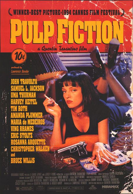
This film poster shows a very creative and effective visual of promoting Pulp Fiction, Showing a frayed comic book cover as a layout, showing that through the damage of the cover, that the story (film) is rough and sets out a prominent look of violence. This is also due to the image displayed largely on the front showing a gun placed in front of the woman. This theme gives off the impression of a comic book styling for the actual film, suggesting to the receiving audience that these could hold the violent, slapstick conventions that you find in comics.
The titles shown on the cover are also that of what you would find on a comic book, with bright yellow capitals in bold, against a bright red background, it sets the outline for a bold movie, again with the violent conventions being conformed to with the red background. Although we see two areas of black text, the first underneath the title stating "a Quentin Tarantino film", this would be an effective statement to put onto the film's poster, due to the fact that Tarantino isa highly successful film directer and writer (amongst other things), which effectively draws in his fans to come and see his next film. Then the last black stated at the top of the poster which claims success for the film," Winner best picture 1994 cannes film festival", which again effectively aims for the target audience ,who attend the film in cinemas and buy the film, to be an older audience who appreciate film, due to it's high success from critics.
The image also states a lot about the film with the woman taking up the majority of the poster and being the main focus on the cover, showing her wearing all black as she smokes a cigarette, wearing red lipstick. Her mise en scene portrays her as a seductive and powerful woman due to her having a gun laid in front of her, as she appears to be lying on a bed also reading what appears to be a book called Pulp fiction, making an echo chamber of sorts occur due to this, her expression also shows her to be a very serious woman, also due to the fact that she is staring directly into the camera and is not accompanied by anyone, makes the audience find her very enticing and makes them wonder more about her character and more about her role within the film. Also the way her hand is positioned on the book, almost grasping it, makes it appear as though it states a way of life or a moral that the film bases its plot on.
Overall this poster proves to be very effective due to the creative way they layout their poster, with their target audience although seeming to be young due to the comic book style, need to appreciate the sense of art within film due to its high success and critical acclaim.
Film Poster Analysis:Black Swan

The film's poster effectively shows the deeper meaning behind this film, with many different observations that people can draw from it. The most obvious points we can draw from this is the solid visual of an attractive young woman seen staring powerfully at the audience. Which links to the films plot of wanting Nina to possess the persona of the "black swan", which is powerful and evil.
Her mise en scene can both convert to this and subvert. Her makeup shows her to be very pale, with dark eyes and rose red lips, creating an almost vampire-esque image, fitting to her image of being mentally ill with her explicit out of this world hallucinations. Although her white fluffy hair piece we can see, shows her to have some innocence and purity about her persona, including the dainty flower shaped diamond earrings, which a child would wear, putting her into an infant character.
The most bewildering part of the film's poster would be the bold crack seen covering the girl's face, which could be interpreted as something breaking out of her pretty and polished look, making an appearance of something darker, making an almost frightening factor that disrupts her distilled image. This paired with the completely black background, makes the receiving audience focus solely on her, showing the audience both that the film's premise will follow this woman, but also that she wants people's attention.
The text that the film's title and other credits, are shown in a simple but bold font in black, to match the film's title "Black Swan", although next to the girl's face we see in smaller writing a quote, stating that the film is "An extraordinary intoxicating masterpiece", showing the film as a serious picture. Effectively aiming at the right crowd who want to see an academy award worthy film,which would be older middle to upper class members of the public.
Film Poster Analysis:Shaun of the Dead

The film's genre sits on a satire horror, whilst containing the imagery and plot of a horrific situation, with the possibility of death, The movie still shows a comedic side to the apocalypse by having the less than able Shaun and Ed try and fight off zombies and keep their spirits light hearted.
This is shown within the poster, where we see a Ginger man in a bright red tie and white shirt, holding a bunch of florescent yellow flowers, as he stands awkwardly on the train as he is surrounded by green skinned, white eyed zombies, showing the audience that what should be an expression of fear being replaced with almost a look of sarcasm shows the humour within the picture and that it's not a serious horror film.
The font used within the poster shows an all capitals titles, where it seems to have been worn off it certain areas, showing a rough sense to the film and that nothing stays pristine and perfect through the plot. Within the main title "shaun of the dead", we can see that within the letter "a" in dead there is a grasping hand coming out of the ground, again giving off the sense of the living dead and showing the zombie theme.
Subtly written slogans are also written in white to stand off of the bright, yet blackened in certain areas, background, also possesses the satirical comedy that is shown visually within the poster also, with at the top of the poster stating " ever felt like you were surrounded by zombies?", Also hinting the plot to be starring characters of the average every day life, due to the rhetorical question that makes the audience put themselves into the leading character's shoes.
The second slogan is seen again in small righting underneath the main title, stating more about the the type of film it is, but again in a satirical and voiced in a way that would be said by the average cinema goer who was telling their friends about it. which goes as follows "A romantic comedy.With zombies."
In conclusion this poster effectively shows the conventions of their film's genre, plot and who their target audience is, both visually and with the slogans they use. As this would appeal to movie goers who want to be thrilled with both humour and horror, which would be by the average working class male, which forms the main leading characters characteristics.
Trailer Analysis: Stephan King's I.T.


Trailer Analysis:Drag me to Hell


Thursday, 6 October 2016
The Purge 3:Election Year Trailer Analysis

We open to a panning close up shot of a frame on a wall, distorted and hanging, where we can make out a quote within the frame stating " Welcome to our home", immediately making the receiving audience presume a break in, as the eery wind like sounds, make for a very uncomfortable feeling among viewers as the tension builds.


We then finally see the senator captured and in church as she is tied up in a white gown, in front of a table of weaponry, and a cathedral full of people, as she seems to be about to be tortured, we then cut to the title of the film, making the audience wonder whether the senator will live or not.
Subscribe to:
Posts (Atom)